Clément Gay: A bottle that marks a breakthrough
Situated in the heart of the wine-growing region, the estate covers nine hectares of vines, where a team of four people work year-round.
The estate makes particular use of regional grape varieties such as Païen and Crête noire, as well as indigenous varieties such as Petite Arvine. Based in Charrat, a picturesque village on the left bank of the Rhône, the company showcases this unique terroir through the cultivation of varieties such as Pinot, Gamay and Diolinoir.
A passion for vines and respect for the terroir
Owner Clément Gay discovered his vocation almost by chance. He trained in arboriculture and viticulture, obtaining his CFC in 2006. Committed to viticulture that respects grape varieties, he makes his wines without the use of synthetic products. After taking charge of the first three vintages from vineyard to bottling, he decided in 2018 to entrust the vinification to Julien Fournier, so that he could concentrate entirely on growing the vines and guaranteeing a high-quality harvest.
Thanks to this collaboration, the farm has enriched its range with new creations, such as a Païen grown on the slopes of Charrat and a Cornalin, produced for two vintages from the vines of Saint-Léonard. In addition, the Crête noire blend, made from Pinot Noir and Diolinoir, bears witness to the farm’s commitment to promoting regional grape varieties.
Revolutionising a range: the impact of format and digital printing
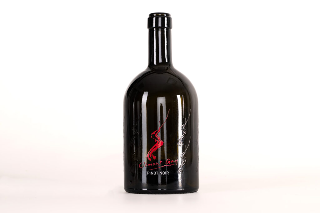
Clément Gay wanted to launch a new range of products while respecting the visual imprint that characterises it, with its distinctive logo and signature.
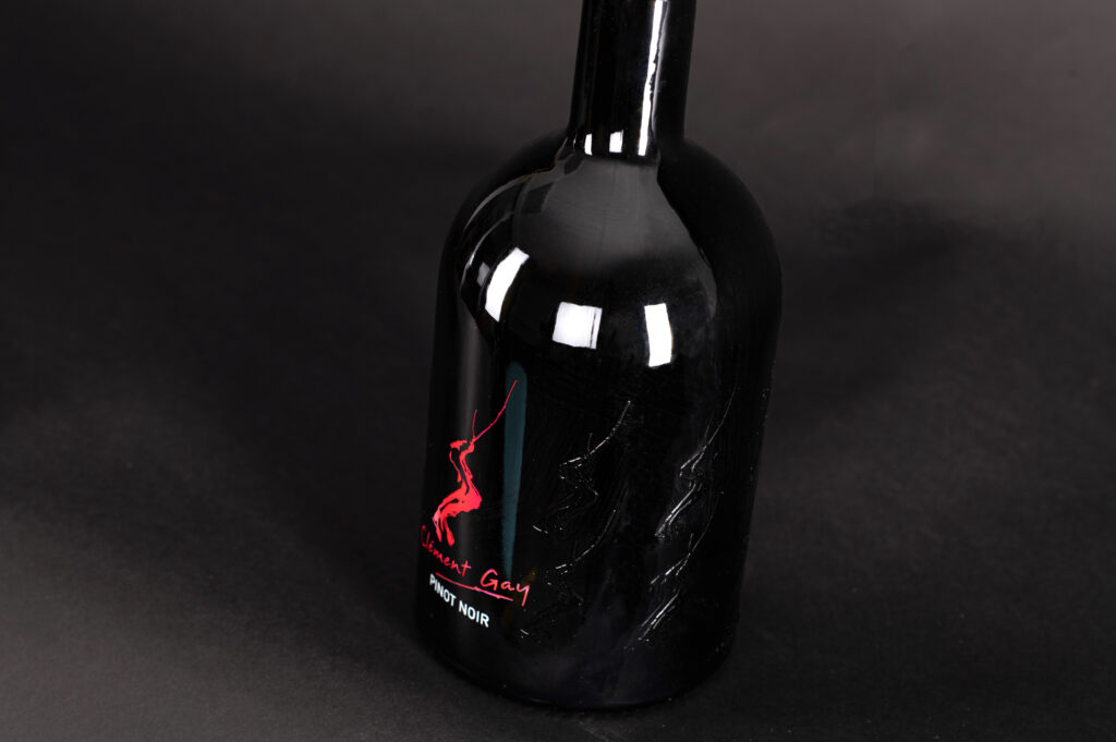
The idea was to create a break with the traditional range, while bringing in a breath of modernity. ‘I wanted to create a new range while retaining the company’s imprint,’ says Clément Gay. To achieve this, digital printing was chosen, offering greater flexibility and a minimalist aesthetic. This technical choice helped to make the object more sober and uncluttered, in perfect harmony with the design of the logo.
The real challenge lay in the format of the bottle. The half-magnum, lower and wider than the usual formats, contrasts with the slender elegance of traditional bottles. This deliberate contrast between the shape of the bottle and the slender logo was not taken lightly, but aims to mark a difference while maintaining a certain visual coherence. ‘Sometimes going beyond the traditional upsets habits, and the object is debated,’ he adds. This bold choice allows us to explore new visual harmonies and gives the new range a unique character, while remaining true to the spirit of the company.
Discover our printing methods
Screen printing
Screen printing on glass offers the possibility of printing in up to six colours and incorporating precious metals such as gold or platinum to enhance designs. Ceramic ink is baked into the glass, ensuring dishwasher resistance for decorated objects.
Digital printing
Univerre Pro Uva uses a state-of-the-art digital printer to meet the growing demand for innovative packaging designs. This technology opens up new possibilities for personalisation.
